As a frontend professional, it’s important to understand layouts & animations that help you create better designs. In this article, we will see some CSS techniques that you may find helpful. Let’s start-
1. CSS Grid
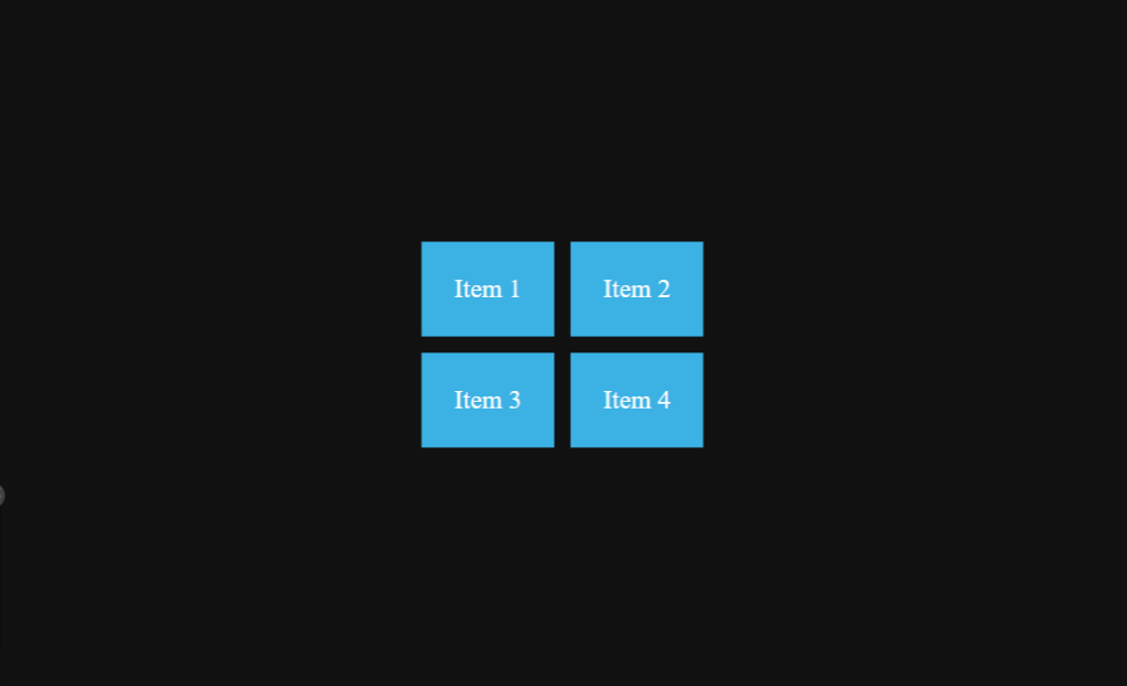
CSS Grid is a grid-based layout system that allows you to create rows and columns with ease. Here’s a simple example of using CSS Grid to create a two-column layout with grid-template-columns :
<div class="grid-container">
  <div class="item">Item 1</div>
  <div class="item">Item 2</div>
  <div class="item">Item 3</div>
  <div class="item">Item 4</div>
</div>
.grid-container {
display: grid;
grid-template-columns: 1fr 1fr; /* Creates two columns with equal width */
grid-gap: 10px; /* Adds 10px gap between grid items */
padding: 20px;
}
.item {
background-color: lightblue;
padding: 20px;
text-align: center;
}In this example, the .grid-container class sets up a CSS grid with two columns of equal width using grid-template-columns. We have used grid-gap to set the gap between grids.
Here is the result –
2. Flexbox
Flexbox is another layout system that offers a more straightforward and efficient way to align items within a container.
It allows you to create flexible and responsive layouts that adjust to different screen sizes and orientations.
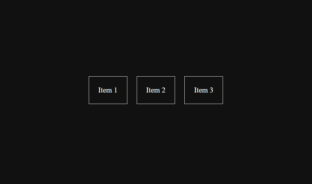
Here’s a simple example of using Flexbox to create a basic layout where items are horizontally aligned and centered within a container –
<div class="container">
  <div class="item">Item 1</div>
  <div class="item">Item 2</div>
  <div class="item">Item 3</div>
</div>
.container {
display: flex;
justify-content: center; /* Centers items horizontally */
align-items: center; /* Centers items vertically */
height: 200px; /* Set a fixed height for the container */
}
.item {
margin: 10px; /* Add some margin between items for spacing */
padding: 20px; /* Add padding to make items visually appealing */
border: 1px solid black; /* Add a border for better visibility */
}In this example, the .container class is set to display: flex;, which enables Flexbox layout and we can make use of flex properties to align our items.
The justify-content: center; property centers the items horizontally within the container, and align-items: center; centers the items vertically.
Here is the result –
3. CSS Animations
CSS Animations can add interactivity and engagement to your website or application.
They allow you to create animations that respond to user actions, such as hovering over an element or clicking on a button. Also, there can be interactive animations as well where user interaction is not needed.
Here’s an example of a CSS animation that makes a circle pulsing:
<div class="circle"></div>.circle {
width: 100px;
height: 100px;
background-color: white;
border-radius: 50%; /* Creates a circle shape */
animation: pulse 1.5s infinite; /* Apply the pulse animation with a duration of 1.5 seconds and repeat infinitely */
}
@keyframes pulse {
0% {
transform: scale(1); /* Initial scale */
}
50% {
transform: scale(1.2); /* Scale up to 1.2 at 50% of the animation duration */
}
100% {
transform: scale(1); /* Return to the original scale at the end of the animation */
}
}In this example, The animation property is used to apply the pulse animation to the circle element with a duration of 1.5 seconds, and the infinite value makes the animation repeat infinitely.
The @keyframes rule defines the pulse animation, which scales the circle up and down to create a pulsating effect.
Here is the result –