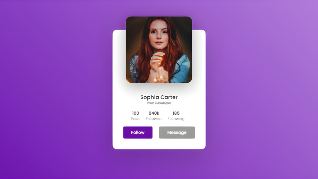
In this tutorial, we’ll explore how to create a sleek, modern profile card using pure HTML and CSS. This interactive design will showcase smooth hover effects and transitions, making it a visually appealing addition to any project.
By the end of this tutorial, you’ll learn how to:
- Structure the HTML for a responsive profile card.
- Style the card with CSS, including hover animations for dynamic interaction.
- Add details like user information, buttons, and stats in an organized layout.
Whether creating a user profile section for a portfolio or adding cards to a dashboard, this tutorial will help you design a polished and professional component.
Setting Up the HTML Structure
The HTML structure for the profile card is simple and semantic:
- Card Container: The outer wrapper holding all the card elements.
- Profile Image: Displayed prominently at the top of the card in a circular container.
- Content Section: Includes the name, role, stats (posts, followers, following), and buttons (Follow and Message).
Styling the Profile Card with CSS
CSS brings the card to life with:
Rounded Borders and Shadows Use border-radius: 15px; for the card and border-radius: 20px; for the profile image box to give a soft look. Add depth with box-shadow, creating a clean, professional feel.
Transitions for Hover Effects Smooth hover animations are achieved using transition: 0.5s;. The profile image enlarges, and the card height increases for an engaging effect.
Centering Content Flexbox ensures the card content is neatly centered with justify-content and align-items properties.
Typography Use clean fonts like 'Poppins', sans-serif with varying weights for a modern design. The user’s name is bold (font-weight: 600), while the role and stats are lighter for contrast.
Adding Interactivity with Hover Effects
Card Hover Animation When hovering over the card the height increases smoothly to reveal hidden details like stats and buttons.
Image Expansion The profile image grows on hover for a focal effect. transform: scale() is used to scale the image while maintaining its position.
Button Animations Pointer cursor and a subtle scale effect (scale(1.1)) for hover feedback.
Source Code
<div class="card">
    <div class="imgBox">
      <img
        src="https://images.pexels.com/photos/3764119/pexels-photo-3764119.jpeg?auto=compress&cs=tinysrgb&w=1260&h=750&dpr=1">
    </div>
    <div class="content">
      <div class="details">
        <h2> Sophia Carter<br> <span>Web Developer</span></h2>
        <div class="data">
          <h3>100<br><span>Posts</span>
            <h3>
              <h3>940k<br><span>Followers</span>
                <h3>
                  <h3>185<br><span>Following</span>
                    <h3>
        </div>
        <div class="actionBtn">
          <button>Follow</button>
          <button>Message</button>
        </div>
      </div>
    </div>
  </div>
@import url('https://fonts.googleapis.com/css? family=Poppins:100,200,300,400,500,600,700,800,900');
* {
margin: 0;
padding: 0;
box-sizing: border-box;
font-family: 'Poppins', sans-serif;
}
body {
display: flex;
justify-content: center;
align-items: center;
min-height: 100vh;
background: linear-gradient(45deg, #6a0dad, #b57edc);
}
.card {
position: relative;
width: 350px;
height: 190px;
box-shadow: 0 35px 80px rgba(0, 0, 0, 0.15);
background: #fff;
border-radius: 15px;
transition: 0.5s;
}
.card:hover {
height: 450px;
}
.imgBox {
position: absolute;
left: 50%;
top: -50px;
transform: translateX(-50%);
width: 150px;
height: 150px;
background: #fff;
border-radius: 20px;
box-shadow: 0 15px 50px rgba(0, 0, 0, 0.35);
overflow: hidden;
transition: 0.5s;
}
.card:hover .imgBox {
width: 250px;
height: 250px;
}
.imgBox img {
position: absolute;
top: 0;
left: 0;
width: 100%;
height: 100%;
object-fit: cover;
}
.card .content {
position: absolute;
width: 100%;
height: 100%;
display: flex;
justify-content: center;
align-items: flex-end;
overflow: hidden;
}
.card .content .details {
padding: 40px;
text-align: center;
width: 100%;
transition: 0.5s;
transform: translateY(150px);
}
.card:hover .content .details {
transform: translateY(0px);
}
.card .content .details h2 {
font-size: 1.25rem;
font-weight: 600;
color: #555;
line-height: 1.2rem;
}
.card .content .details h2 span {
font-size: 0.75rem;
font-weight: 500;
opacity: 0.5;
}
.card .content .details .data {
display: flex;
flex-direction: row;
align-items: center;
justify-content: center;
gap: 10px;
margin: 20px 0;
}
.card .content .details .data h3 {
font-size: 1em;
color: #555;
line-height: 1.2em;
font-weight: 600;
}
.card .content .details .data h3 span {
font-size: 0.85rem;
font-weight: 400;
opacity: 0.5;
}
.card .content .details .actionBtn {
display: flex;
justify-content: space-between;
}
.card .content .details .actionBtn button {
padding: 10px 30px;
border-radius: 5px;
border: none;
outline: none;
font-size: 1rem;
font-weight: 500;
background: #6a0dad;
color: #fff;
cursor: pointer;
}
.card .content .details .actionBtn button:nth-child(2) {
border: 1px solid #999;
background: #999;
}Wrapping Up
Creating an interactive profile card with smooth animations using CSS not only enhances the visual appeal but also improves user experience. Whether you’re building a personal project or integrating it into a larger web application, this approach can elevate your design with minimal effort. Keep experimenting with different animation styles to add more depth and polish to your web projects. Happy coding!