In this article, we will go through some Cool Button Glow Effects Using CSS. Let’s start
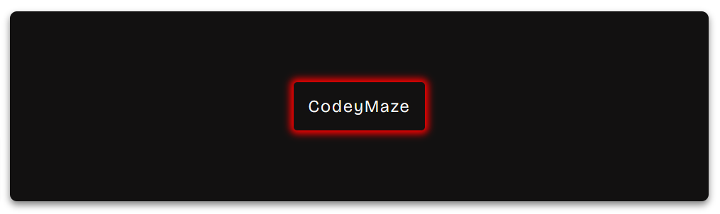
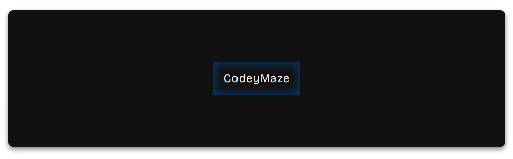
Outer Glow Effect
This effect adds a soft glow around the outer edges of the button. We can do this using the box-shadow property in CSS, where a shadow is cast around the button.
.outer-glow-button {
  background-color: #121111;
  color: white;
  border: none;
  padding: 20px 20px;
  border-radius: 5px;
  letter-spacing: 2px;
  font-size: 24px;
  position: relative;
  overflow: hidden;
  box-shadow: 0 0 10px 5px red;
}
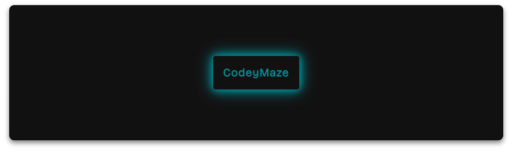
Neon Effect
This effect replicates the vibrant glow of neon lights. Multiple layers of glowing shadows are added using the box-shadow property, creating a glowing appearance.
.neon-button {
  background-color: #222;
  color: #008E97;
  padding: 20px 20px;
  border: none;
  font-size: 22px;
  letter-spacing:1.5px;
  font-weight: bold;
  border-radius: 5px;
  box-shadow: 0 0 10px #008E97, 0 0 20px #008E97, 0 0 30px #008E97;
}
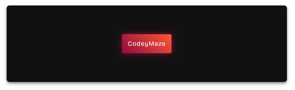
Gradient Glow Effect
In this example, we will create a button with a gradient background and a glow effect. The button’s background transitions from its original color to transparent using a linear gradient. And the box-shadow property adds a glow to the button’s corners.
.gradient-button {
  color: #fff;
  padding: 20px 20px;
  border: none;
  font-size: 22px;
  letter-spacing:1.7px;
  border-radius: 5px;
  background: linear-gradient(45deg, #900C3F, #FF5733);
  box-shadow: 0 0 20px #900C3F;
}
Inner Glow Effect
In contrast to the outer glow, the inner glow creates a soft, luminous effect along the inner corners of the button. The box-shadow property with the inset keyword is used to achieve this, providing the appearance of light emanating from within the button.
.inner-glow-button {
  background-color: #121111;
  color: #fff;
  padding: 20px 20px;
  font-size: 22px;
  letter-spacing:1.5px;
  border: none;
  border-radius: 5px;
  box-shadow: inset 0 0 20px #034694;
}
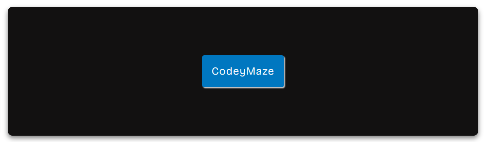
Drop Shadow Effect
The drop shadow effect creates the button being slightly raised above the background.
.drop-shadow-button {
  background-color: #0077c0;
  color: #fff;
  padding: 20px 20px;
  font-size: 22px;
  letter-spacing:1.5px;
  border: none;
  border-radius: 5px;
  box-shadow: 2px 2px 2px #ccc;
}
Pulse Glow Effect
The pulse glow effect adds an animated glow that gently pulses around the button. This animation is achieved using the @keyframes rule in CSS, which alternates between two different levels of glow intensity.
.pulse-glow-button {
  background-color: #EF820D;
  color: #fff;
  padding: 20px 20px;
  font-size: 22px;
  letter-spacing:1.5px;
  border: none;
  border-radius: 5px;
  animation: pulse 1s infinite alternate;
}
@keyframes pulse {
    0% {
      box-shadow: 0 0 10px black;
    }
    100% {
      box-shadow: 0 0 20px black;
    }
}
See the Pen Pulse Glow by CodeP (@Harpreet-Kaur-the-selector) on CodePen.
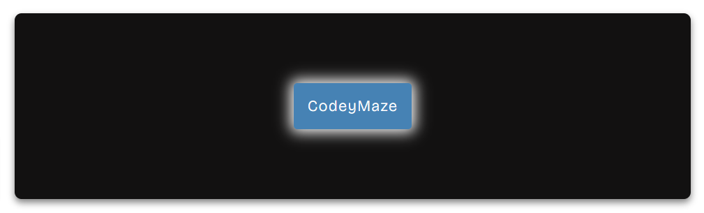
Rim Light Glow
In this effect, a soft glow is applied only around the outer rim of the button.
.rim-glow-button {
  background-color: #4682B4;
  color: #fff;
  padding: 20px 20px;
  font-size: 22px;
  letter-spacing:1.5px;
  border: none;
  border-radius: 5px;
  box-shadow: 0 0 20px 5px #fff;
}