In this tutorial, we’ll walk through how to create a modern and interactive login form using Tailwind CSS for styling and GSAP (GreenSock Animation Platform) for smooth animations. Tailwind CSS will help us quickly build a clean, responsive design with utility classes, while GSAP will add dynamic effects to make the form more engaging.
By the end of this tutorial, you’ll learn how to:
- Style the login form using Tailwind’s utility-first classes.
- Animate the form’s elements to create a polished experience for users.
- Add interactive animations such as smooth hover effects and focus animations to input fields and buttons.
Whether you’re building a simple login form for a personal project or integrating it into a larger application, this tutorial will give you the foundation you need to create a user-friendly design.
Let’s get started!
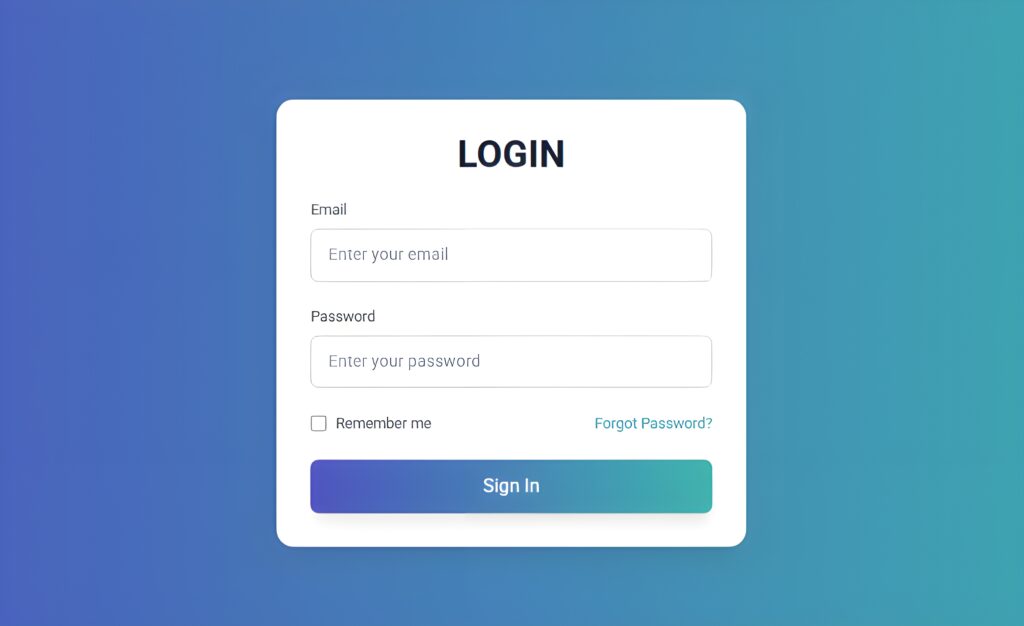
Setting Up the HTML Structure
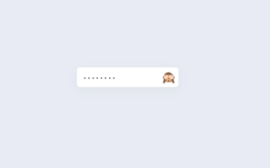
The HTML is structured to provide a clean, semantic layout for the login form:
- A title of the form ‘Login’
- Email and Password fields with labels
- A remember me checkbox and forgot password link
- Sign-in button for form submission
Styling with Tailwind CSS
Tailwind CSS makes it easy to create modern, responsive forms.
Rounded Borders: Use rounded-lg for smooth, rounded corners on the form and input elements.
Spacing: Utility classes like px-4, py-3, and space-y-6 control padding and spacing between form elements, making everything neat and organized.
Transitions: To make the form feel more interactive, transition-all and duration-300 are applied to input fields and buttons for smooth hover effects.
Adding Animations with GSAP
Animations bring an extra layer of interactivity and can make the user experience more engaging. We’ve incorporated GSAP for dynamic effects.
Staggered Form Load Animation: As soon as the page loads, the form title and input fields appear one by one with a staggered effect. We use the stagger method, which adds a delay between each element’s appearance, making the form load smoothly and gradually.
Interactive Animations on Input Fields: The input fields grow slightly when they are focused, adding a dynamic feel to the form. When focused, the input fields also get a glowing shadow effect, giving users visual feedback that they are ready to interact with them.
Button Hover Animations: The “Sign In” button grows when hovered over, providing feedback that it is clickable. The scale method is used here as well, to gently enlarge the button when the user hovers, making it more interactive.
Source Code
Simple copy and paste the HTML file by clicking on the copy, you need to create one HTML file and one script file
<!DOCTYPE html>
<html lang="en">
  <head>
    <meta charset="UTF-8" />
    <meta name="viewport" content="width=device-width, initial-scale=1.0" />
    <title>Interactive Login Form</title>
    <!-- Tailwind CSS CDN -->
    <script src="https://cdn.tailwindcss.com"></script>
    <!-- GSAP CDN -->
    <script
      src="https://cdnjs.cloudflare.com/ajax/libs/gsap/3.12.2/gsap.min.js"
      defer
    ></script>

    <style>
      @import url("https://fonts.googleapis.com/css2?family=Roboto:wght@300..700&display=swap");

      body {
        background: linear-gradient(to right, #4c51bf, #38b2ac);
        font-family: "Roboto", sans-serif;
      }

      input:focus {
        outline: none;
      }

      .input-field {
        border: 2px solid #d1d5db;
        transition: border-color 0.3s, box-shadow 0.3s;
      }

      .input-field:focus {
        border-color: #38b2ac;
        box-shadow: 0 0 5px rgba(56, 178, 172, 0.5);
      }

      .custom-checkbox {
        accent-color: #38b2ac;
      }

      .hover-link {
        color: #38b2ac;
        transition: color 0.3s;
      }

      .hover-link:hover {
        color: #4c51bf;
      }

      .sign-in-button {
        background: linear-gradient(to right, #4c51bf, #38b2ac);
      }

      .sign-in-button:hover {
        background: linear-gradient(to left, #4c51bf, #38b2ac);
      }
    </style>
  </head>
  <body class="flex items-center justify-center min-h-screen">
    <div id="login-form" class="w-full max-w-md">
      <div class="bg-white shadow-lg rounded-2xl p-8">
        <!-- Title -->
        <h2
          id="form-title"
          class="text-4xl uppercase font-bold text-center mb-6 text-gray-900"
        >
          Login
        </h2>
        <form action="javascript:void(0);" method="POST" class="space-y-6">
          <!-- Email Input -->
          <div id="email-input">
            <label for="email" class="block text-sm text-gray-600 mb-2"
              >Email</label
            >
            <input
              type="email"
              id="email"
              name="email"
              required
              class="input-field w-full px-4 py-3 rounded-lg shadow-sm"
              placeholder="Enter your email"
            />
          </div>

          <!-- Password Input -->
          <div id="password-input">
            <label for="password" class="block text-sm text-gray-600 mb-2"
              >Password</label
            >
            <input
              type="password"
              id="password"
              name="password"
              required
              class="input-field w-full px-4 py-3 rounded-lg shadow-sm"
              placeholder="Enter your password"
            />
          </div>

          <!-- Remember me and Forgot Password -->
          <div class="flex justify-between items-center">
            <label
              class="flex items-center text-sm text-gray-600"
              id="remember-me"
            >
              <input
                type="checkbox"
                class="custom-checkbox h-4 w-4 rounded"
              />
              <span class="ml-2">Remember me</span>
            </label>
            <a
              href="#"
              id="forgot-password"
              class="hover-link text-sm"
              >Forgot Password?</a
            >
          </div>

          <!-- Sign In Button -->
          <div id="sign-in-button">
            <button
              type="submit"
              class="sign-in-button w-full py-3 text-white text-lg rounded-lg transition duration-300 ease-in-out shadow-lg"
            >
              Sign In
            </button>
          </div>
        </form>
      </div>
    </div>

    <script src="script.js"></script>
  </body>
</html>
JS Code
document.addEventListener("DOMContentLoaded", () => {
    gsap.from("#form-title", { opacity: 0, y: -20, duration: 1 });
    gsap.from("#email-input", { opacity: 0, x: -50, duration: 1, delay: 0.2 });
    gsap.from("#password-input", { opacity: 0, x: -50, duration: 1, delay: 0.4 });
    gsap.from("#sign-in-button", { opacity: 0, scale: 0.8, duration: 1, delay: 0.6 });
});
Wrapping Up
You’ve successfully created a stylish and interactive login form using Tailwind CSS for the design and GSAP for animations. You’ve learned how to:
- Build a clean, responsive form layout with Tailwind CSS utility classes.
- Enhance the user experience with smooth animations that load the form and make it feel dynamic.
- Add interactivity to input fields and buttons with focus and hover effects.
With these techniques, you can easily adapt the form to fit any project, adding more styling and animations as needed. Tailwind CSS and GSAP are powerful tools that, when combined, can help you create professional and engaging user interfaces.